
-
The Surface Problem: A Dashboard That Looks Confident
-
The Deeper Cause #1: Intent Data Aggregates Noise, Not Meaning
-
The Deeper Cause #2: Internal Disruption Signals Are Context, Not Intent
-
The Deeper Cause #3: Waterfall Enrichment Compounds the Problem
-
The Real Cost: CRM Rot and a Team That Stops Believing the Data
-
The Fix (Short Version): Add a Quality Gate, Not Just More Data
Last quarter, I reviewed a 212-account list pulled from an intent data platform. Every row had an intent score. Every row had a source. Every row looked ready to hand to an SDR. It looked beautiful.
Forty-three of those accounts were duplicates. Thirty-one email addresses bounced in the first test send. And one of the “high-intent” accounts was a county government in Florida whose only signal was that the word “clay” appeared in the name of the county.
I’m the quality inspector. I don’t write the sales scripts, and I don’t pick the target accounts. I review the data before it reaches the team. When something fails, I trace it back to where it went wrong. This one was easy to trace: it went wrong at the exact moment the dashboard turned a signal into a verdict.
The Surface Problem: A Dashboard That Looks Confident
This was not a cheap tool. It was a recognized intent data platform. The dashboard gave us a score (87/100), a signal tag (“internal disruption signals”), and a suggested next step. It also gave us a confidence that turned out to be completely misplaced.
I don’t say that to mock intent data. Most of the coverage on this problem lands in one of two camps: either “intent data is a scam” or “you’re not using it right.” Both are too simple. The real issue is that platforms are designed to surface probabilities, but they present them as facts. A signal is a hint. Somewhere between the hint and the outreach, the hint becomes an order.
The first thing I check in any audit isn’t the data itself. It’s the setup—how intent sources are mapped, whether deduplication is on, whether confidence thresholds are enforced, and what the enrichment waterfall is doing in the background. Most of the time, the dashboard isn’t lying. It’s just solving a different problem than the one we’re trying to solve.
The Deeper Cause #1: Intent Data Aggregates Noise, Not Meaning
Here’s a phrase I still remember from an actual record: “Clay County Florida internal disruption signals.” Score: 87. When I opened the account, it was the public administration office for Clay County, Florida. There was a zoning meeting, some budget language, and a job posting for a city administrator.
None of that meant they were buying. The word “clay” matched our marketplace keyword. “Internal disruption” matched a template that scans meeting minutes. The platform did its job. It just didn’t have context.
If that were one record, you could shrug. It’s not one record. In a 10,000-row sample, I keep seeing the same failure modes: city names that collide with account names, company names that contain product keywords, press releases about a new logo being scored as purchase intent. If a signal is generic enough, it will find false positives everywhere.
This is why an intent data dashboard can look busy and still be useless. Activity is not the same as meaning.
The Deeper Cause #2: Internal Disruption Signals Are Context, Not Intent
“Internal disruption signals” is one of those phrases that sounds precise until you try to act on it. Leadership change. Funding round. Office closure. Data breach. Reorg. These are real events. They are also ambiguous events.
A CFO leaving could mean the company is preparing for acquisition, hiding a financial problem, or just watching someone retire. A new office in Austin could mean expansion—or a consolidation that came with layoffs. In my experience, the same signal can map to a buying trigger or a “do not call” trigger depending on the quarter.
So when a sales team says they’re targeting companies with “internal disruption signals,” my first question is: whose interpretation is attached to that signal? If the platform adds a one-line reason, great. But the reason is almost never enough to decide the next action.
Here’s an argument that sounds unpopular: an ambiguous signal should lower the priority score, not raise it. A false positive costs more than a false negative. A false negative just means you miss one account. A false positive means three weeks of outreach to a company that was never going to buy—plus a team that starts distrusting the dashboard.
The Deeper Cause #3: Waterfall Enrichment Compounds the Problem
So what is waterfall enrichment and when should a b2b sales team use it?
Waterfall enrichment is when you query multiple data providers in a defined sequence. If the first provider returns a match with confidence above your threshold, you keep it and stop. If it doesn’t, you fall through to the next provider. Repeat. The goal is to maximize coverage without paying for every source on every record.
It sounds straightforward. In practice, it solves one problem and introduces another. You get more complete records, yes. But you also inherit each provider’s quirks. One provider might succeed at company-level firmographics but fail at direct dials. Another has great email data but weak intent. A poorly designed waterfall takes the best available answer from each source and stitches them together into a record that has never existed as a single verified identity.
I’ve seen enrichment waterfalls that output five contact records for the same person because each provider had a slightly different email or phone format. I’ve seen “verified” emails where the verification step was: one provider couldn’t confirm it, so it fell to the next, which also couldn’t confirm it—but the fallback flagged a generic inbox as valid. That’s not enrichment. That’s educated guessing with extra steps.
So when should a B2B sales team use waterfall enrichment? In my opinion, when you need broad volume from a wide ICP, when you’re buying contact-level data from sources with different strengths, and when you have a quality gate after the waterfall. That final condition is the one I see skipped most often.
If you’re a small team working a narrow account list with one strong source, you don’t need a waterfall. You need a better source. Waterfall enrichment is a coverage tool, not a truth tool. Use it to fill gaps. Don’t use it to replace judgment.
The Real Cost: CRM Rot and a Team That Stops Believing the Data
Let’s talk about what bad data actually costs. Not in theory—in the conversation I have with RevOps teams every month.
First, wasted hours. An SDR will spend three days researching a false positive account, building a sequence, and sending replies into the void. That time is gone. It’s the most expensive line item in prospecting, and it’s invisible in the dashboard.
Second, deliverability damage. I sent a test of 212 records and watched 31 bounce. If a sales team had sent that same list through their engagement platform without testing, they’d be feeding the spam filters. The damage doesn’t show up as a line item. It shows up later, when fewer emails land.
Third, CRM rot. Every bad record that makes it into the CRM becomes a tax on future work. Someone has to deduplicate, re-enrich, or apologize when the data is wrong. In one audit we found 8,400 stale contacts from a single “temporary” import that happened two years earlier. Nobody owned it. The CRM became a museum of old mistakes.
Fourth, trust. This is the one nobody budgets for. When a dashboard says “high intent” and the account turns out to be irrelevant, the team learns to ignore the dashboard. Once that mental model sets in, good signals get ignored too. The tool might become more accurate later, but the reputation damage stays. In this business, the output is your brand—even if you didn’t intend it to be.
The Fix (Short Version): Add a Quality Gate, Not Just More Data
I’m not going to turn this into a product tutorial. The fix is less complicated than most vendors want it to be.
- Treat intent data as triage. Use it to prioritize lists, not to justify outreach. An 87 score is a starting point for review, not a reason to skip review.
- Apply confidence thresholds at the source level. If a provider’s match confidence is below your cutoff, fall through to the next source—or leave the field blank. Blank is better than wrong.
- After the waterfall, verify. A simple verification step before the list reaches the CRM catches duplicates, format errors, and bounces. It doesn’t need to be expensive. It needs to be mandatory.
- Review false positives quarterly. Every time the SDRs send back an account and say “this is wrong,” the platform should learn. If it can’t learn, the dashboard should be demoted to noise.
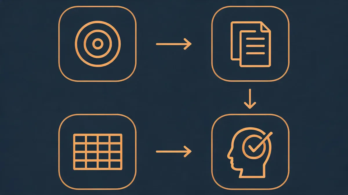
And about the latest Clay CRM news: a lot of what the product now does is useful. Enrichment, intent signals, and outreach can live in one workflow. The same Clay instance that handles enrichment can handle verification: use one provider as the primary, fall through only when confidence is low, and log every match for review. That, to me, is what an agent-native workflow should mean—more judgment, not just more automation. The real quality lever isn’t the fiftieth integration. It’s the rule that says “enrich first, verify second, personalize third.”
I’ve rejected enough first deliveries in my career to know the pattern: quality problems don’t announce themselves. They hide in a clean interface. The dashboard looked great. The data didn’t.
That’s what makes quality the brand. Customers will feel the difference even when they can’t name it. And the fix doesn’t require more sources—just more verification. Start with a signal. Verify it before you trust it. By the time you see the next Clay County, Florida, account in your intent data dashboard, you’ll already know not to send that email.